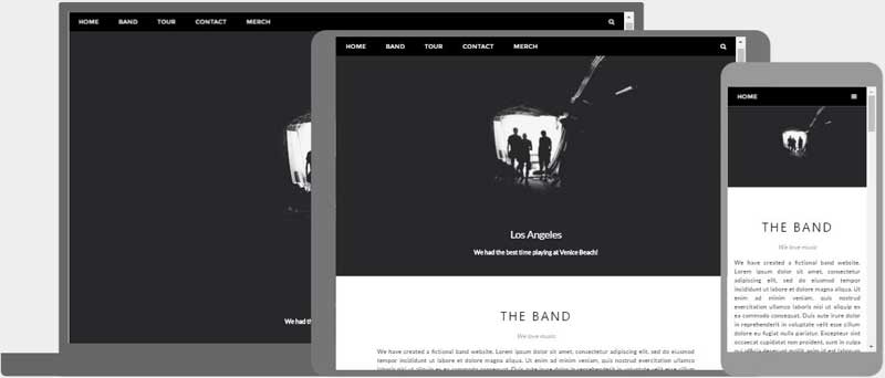
What is Responsive Web Design?
Responsive Web Design is about using HTML and CSS to automatically resize a website.
Responsive Web Design is about making a website look good on all devices (desktops, tablets, and phones):
Setting The Viewport
When making responsive web pages, add the following <meta> element to all your web pages:
Media Queries
Media Queries plays an important role in responsive web pages.
With media queries you can define different styles for different browser sizes.
Example:
Resize the browser window to see that the three elements below will display
horizontally on large screens and vertically on small screens:
Example
<style>
.left, .right {
float: left;
width: 20%; /* The width is 20%, by default */
}
.main {
float: left;
width: 60%; /* The width is 60%, by default */
}
/* Use Media Query to
add a breakpoint at 800px: */
@media screen and (max-width:800px) {
.left , .main, .right {width:100%;}
}
</style>
Try it Yourself »
Learn more about Responsive Web Design at
W3Schools' RWD Tutorial
Responsive Images
Responsive images are images that scale nicely to fit any browser size.
When the CSS width property is set to a percentage value, an image will scale up and down when resizing the browser window.
This image is responsive:

If the max-width property is set to 100%, the image will scale down if it has to, but never scale up to be larger than its original size:
Image Depending on Browser Size
The HTML <picture> element allows you to define different images for
different browser window sizes.
Example
<picture>
<source srcset="img_smallflower.jpg" media="(max-width:
600px)">
<source srcset="img_flowers.jpg" media="(max-width:
1500px)">
<source srcset="flowers.jpg">
<img src="img_smallflower.jpg"
alt="Flowers">
</picture>
Try it Yourself »
Responsive W3.CSS
W3.CSS is a free CSS Framework that offers Responsive Design by default.
W3.CSS makes it easy to develop sites that look nice on any device; desktop, laptop, tablet, or phone:
Example
<!DOCTYPE html>
<html>
<meta name="viewport"
content="width=device-width, initial-scale=1">
<link rel="stylesheet"
href="https://www.w3schools.com/w3css/4/w3.css">
<body>
<div class="w3-center w3-padding-64 w3-light-grey">
<h1>My W3.CSS Page</h1>
<p>Resize this page to see the responsive effect!</p>
</div>
<div
class="w3-row-padding">
<div class="w3-third">
<h2>London</h2>
<p>London is the capital city of England.</p>
<p>It is the most populous city in the United Kingdom,
with a
metropolitan area of over 13 million inhabitants.</p>
</div>
<div
class="w3-third">
<h2>Paris</h2>
<p>Paris is
the capital of France.</p>
<p>The Paris area is one of the largest
population centers in Europe,
with more than 12 million
inhabitants.</p>
</div>
<div class="w3-third">
<h2>Tokyo</h2>
<p>Tokyo is the capital of Japan.</p>
<p>It
is the center of the Greater Tokyo Area,
and the most populous
metropolitan area in the world.</p>
</div>
</div>
</body>
</html>
Try it Yourself »
To learn more about W3.CSS, go to our W3.CSS Tutorial.
Bootstrap
Bootstrap is a very popular framework that uses HTML, CSS and jQuery to make responsive web pages.
Example
<!DOCTYPE html>
<html lang="en">
<head>
<title>Bootstrap
Example</title>
<meta charset="utf-8">
<meta name="viewport"
content="width=device-width, initial-scale=1">
<link rel="stylesheet"
href="https://maxcdn.bootstrapcdn.com/bootstrap/4.1.3/css/bootstrap.min.css">
<script
src="https://ajax.googleapis.com/ajax/libs/jquery/3.3.1/jquery.min.js"></script>
<script
src="https://cdnjs.cloudflare.com/ajax/libs/popper.js/1.14.3/umd/popper.min.js"></script>
<script
src="https://maxcdn.bootstrapcdn.com/bootstrap/4.1.3/js/bootstrap.min.js"></script>
</head>
<body>
<div class="jumbotron text-center">
<h1>My
First Bootstrap Page</h1>
<p>Resize this responsive page to see the
effect!</p>
</div>
<div class="container-fluid">
<div class="row">
<div class="col-sm-4">
<h2>London</h2>
<p>London is the capital city of England.</p>
<p>It is the most populous city in the United Kingdom,
with a
metropolitan area of over 13 million inhabitants.</p>
</div>
<div class="col-sm-4">
<h2>Paris</h2>
<p>Paris is
the capital of France.</p>
<p>The Paris area is one of the largest
population centers in Europe,
with more than 12 million
inhabitants.</p>
</div>
<div
class="col-sm-4">
<h2>Tokyo</h2>
<p>Tokyo is the capital of Japan.</p>
<p>It
is the center of the Greater Tokyo Area,
and the most populous
metropolitan area in the world.</p>
</div>
</div>
</div>
</body>
</html>
Try it Yourself »
To learn more about Bootstrap, go to our Bootstrap Tutorial.
