Bootstrap Theme "Simply Me"
Create a Theme: "Simply Me"
This page will show you how to build a Bootstrap theme from scratch.
We will start with a simple HTML page, and then add more and more components, until we have a fully functional, personal and responsive website.
The result will look like this, and you are free to modify, save, share, use or do whatever you want with it:
HTML Start Page
We will start with the following HTML page:
<!DOCTYPE html>
<html lang="en">
<head>
<title>Bootstrap Theme Simply Me</title>
<meta charset="utf-8">
<meta name="viewport" content="width=device-width, initial-scale=1">
</head>
<body>
<h3>Who Am I?</h3>
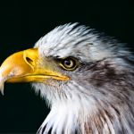
<img src="bird.jpg" alt="Bird">
<h3>I'm an adventurer</h3>
</body>
</html>
Add Bootstrap CDN and Put Elements in Container
Add Bootstrap CDN and a link to jQuery and put HTML elements inside a container:
Example
<!DOCTYPE html>
<html lang="en">
<head>
<title>Bootstrap Theme Simply Me</title>
<meta charset="utf-8">
<meta name="viewport" content="width=device-width, initial-scale=1">
<link rel="stylesheet" href="https://maxcdn.bootstrapcdn.com/bootstrap/3.4.1/css/bootstrap.min.css">
<script src="https://ajax.googleapis.com/ajax/libs/jquery/3.5.1/jquery.min.js"></script>
<script src="https://maxcdn.bootstrapcdn.com/bootstrap/3.4.1/js/bootstrap.min.js"></script>
</head>
<body>
<div class="container-fluid">
<h3>Who Am I?</h3>
<img src="bird.jpg" alt="Bird">
<h3>I'm an adventurer</h3>
</div>
</body>
</html>
Result:
Who Am I?
I'm an adventurer
Add Background Color and Center Text
1. Add a custom class (.bg-1) to the container to add a background color.
2. Add the .text-center class to center the text inside the
container:
Example
<head>
<style>
.bg-1 {
background-color: #1abc9c; /* Green */
color: #ffffff;
}
</style>
</head>
<body>
<div class="container-fluid bg-1 text-center">
<h3>Who Am I?</h3>
<img src="bird.jpg" alt="Bird">
<h3>I'm an adventurer</h3>
</div>
</body>
Result:
Who Am I?
I'm an adventurer
Circle Image
Shape the image to a circle with the .img-circle class:
Example
<img src="bird.jpg" class="img-circle" alt="Bird">
Result:
Who Am I?
I'm an adventurer
More Content
Add more content and put it inside new containers:
Example
<head>
<style>
.bg-1 {
background-color: #1abc9c; /* Green */
color: #ffffff;
}
.bg-2 {
background-color: #474e5d; /* Dark Blue */
color: #ffffff;
}
.bg-3 {
background-color: #ffffff; /* White */
color: #555555;
}
</style>
</head>
<body>
<div class="container-fluid bg-1 text-center">
<h3>Who Am I?</h3>
<img src="bird.jpg" class="img-circle" alt="Bird">
<h3>I'm an adventurer</h3>
</div>
<div class="container-fluid bg-2 text-center">
<h3>What Am I?</h3>
<p>Lorem ipsum..</p>
</div>
<div class="container-fluid bg-3 text-center">
<h3>Where To Find Me?</h3>
<p>Lorem ipsum..</p>
</div>
</body>
Result:
Who Am I?
I'm an adventurer
What Am I?
Lorem ipsum dolor sit amet, consectetur adipiscing elit, sed do eiusmod tempor incididunt ut labore et dolore magna aliqua. Ut enim ad minim veniam, quis nostrud exercitation ullamco laboris nisi ut aliquip ex ea commodo consequat.
Where To Find Me?
Lorem ipsum dolor sit amet, consectetur adipiscing elit, sed do eiusmod tempor incididunt ut labore et dolore magna aliqua. Ut enim ad minim veniam, quis nostrud exercitation ullamco laboris nisi ut aliquip ex ea commodo consequat.
Add Padding
Lets make the containers look good by adding some padding:
Example
<style>
.container-fluid {
padding-top: 70px;
padding-bottom: 70px;
}
</style>
Result:
Who Am I?
I'm an adventurer
What Am I?
Lorem ipsum dolor sit amet, consectetur adipiscing elit, sed do eiusmod tempor incididunt ut labore et dolore magna aliqua. Ut enim ad minim veniam, quis nostrud exercitation ullamco laboris nisi ut aliquip ex ea commodo consequat.
Where To Find Me?
Lorem ipsum dolor sit amet, consectetur adipiscing elit, sed do eiusmod tempor incididunt ut labore et dolore magna aliqua. Ut enim ad minim veniam, quis nostrud exercitation ullamco laboris nisi ut aliquip ex ea commodo consequat.
Add a Button
Add a button to the mid container:
Example
<div class="container-fluid bg-2 text-center">
<h3>What Am I?</h3>
<p>Lorem ipsum..</p>
<a href="#" class="btn btn-default btn-lg">Search</a>
</div>
Result:
What Am I?
Lorem ipsum dolor sit amet, consectetur adipiscing elit, sed do eiusmod tempor incididunt ut labore et dolore magna aliqua. Ut enim ad minim veniam, quis nostrud exercitation ullamco laboris nisi ut aliquip ex ea commodo consequat.
SearchAdd an Icon
Add a Search icon on the "Search" button:
Example
<a href="#" class="btn btn-default btn-lg">
<span class="glyphicon glyphicon-search"></span> Search
</a>
Result:
Try it Yourself »Modify The Third Container (Add Grid)
Add three columns of equal width inside the third container (.col-sm-4):
Example
<div class="container-fluid bg-3 text-center">
<h3>Where To Find Me?</h3>
<div class="row">
<div class="col-sm-4">
<p>Lorem ipsum..</p>
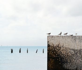
<img src="birds1.jpg" alt="Image">
</div>
<div class="col-sm-4">
<p>Lorem ipsum..</p>
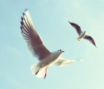
<img src="birds2.jpg" alt="Image">
</div>
<div class="col-sm-4">
<p>Lorem ipsum..</p>
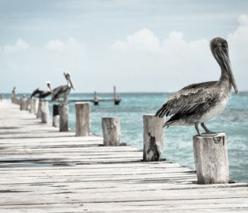
<img src="birds3.jpg" alt="Image">
</div>
</div>
</div>
Result:
Where To Find Me?
Lorem ipsum dolor sit amet, consectetur adipisicing elit, sed do eiusmod tempor incididunt ut labore et dolore magna aliqua.
Lorem ipsum dolor sit amet, consectetur adipisicing elit, sed do eiusmod tempor incididunt ut labore et dolore magna aliqua.
Lorem ipsum dolor sit amet, consectetur adipisicing elit, sed do eiusmod tempor incididunt ut labore et dolore magna aliqua.
Make The Images Responsive
Add the .img-responsive class to all images.
Add display:inline to the first image to force it to be centered
(the .img-responsive class adds display:block
to the image, which makes it jump to the left of the screen).
If you want the image to span the entire width of the screen
when it starts to stack, add width:100% to the image.
When opening the example, remember to resize the screen to see the responsive effect:
Example
<!-- The circular bird -->
<img src="bird.jpg" class="img-responsive img-circle" style="display:inline" alt="Bird">
<!-- The birds in our grid: -->
<img src="birds1.jpg" class="img-responsive" style="width:100%" alt="Image">
<img src="birds2.jpg" class="img-responsive" style="width:100%" alt="Image">
<img src="birds3.jpg" class="img-responsive" style="width:100%" alt="Image">
Try it Yourself »
Add a Navbar
Add a standard navigation bar at the top of the page with and make it collapsible on smaller screens:
Example
<nav class="navbar navbar-default">
<div class="container">
<div class="navbar-header">
<button type="button" class="navbar-toggle" data-toggle="collapse" data-target="#myNavbar">
<span class="icon-bar"></span>
<span class="icon-bar"></span>
<span class="icon-bar"></span>
</button>
<a class="navbar-brand" href="#">Me</a>
</div>
<div class="collapse navbar-collapse" id="myNavbar">
<ul class="nav navbar-nav navbar-right">
<li><a href="#">WHO</a></li>
<li><a href="#">WHAT</a></li>
<li><a href="#">WHERE</a></li>
</ul>
</div>
</div>
</nav>
Result:
Style The Navbar
Use CSS to customize the navigation bar:
Example
.navbar {
padding-top: 15px;
padding-bottom: 15px;
border: 0;
border-radius: 0;
margin-bottom: 0;
font-size: 12px;
letter-spacing: 5px;
}
.navbar-nav li a:hover {
color: #1abc9c !important;
}
Result:
Add a Footer
Add a footer and use CSS to style it:
Example
<style>
.bg-4 {
background-color: #2f2f2f;
color: #ffffff;
}
</style>
<footer class="container-fluid bg-4 text-center">
<p>Bootstrap Theme Made By <a href="https://www.w3schools.com">www.w3schools.com</a></p>
</footer>
Result:
Final Touch
Personalize your Theme by adding a font that you like. We have used "Montserrat" from Google's Font Library.
Link to the font in the
<head> section:
<link href="https://fonts.googleapis.com/css?family=Montserrat" rel="stylesheet">
Then you can use it in the page:
Example
body {
font: 20px "Montserrat", sans-serif;
line-height: 1.8;
color: #f5f6f7;
}
p {font-size: 16px;}
We have also created a "helper" margin class to add extra space
where we think it's needed; usually after each <h3> and <img> element.
