Accessibility Errors
Why
Everyone make mistakes. When we do, we need to understand why we have failed, to be able to correct ourselves. An accessible form needs error messages that is perceivable and understandable for people who is color blind, who is blind or low vision, and people with limited cognitive abilities.
What
An accessible error message is
- written in text. Color and icon can be used, but not alone.
- close to the element that has failed.
- informative, helping the user.
- associated to the failed element in the code.
In addition, is is helpful to move the focus to the form control that has failed.
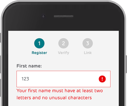
In this registration form, the user has typed a number instead of characters.
How
You will learn five techniques for creating accessible error messages.
Written in text
The error message is written in text, in addition to a warning icon and red border. Three different indicators makes this error situation clear to the user. Only an icon and a red border would not have been sufficient for all users to understand.
Close together
Design elements near each other are perceived as related, while elements spaced apart are perceived as belonging to separate groups.
Design elements near each other are perceived as related, while elements spaced apart are perceived as belonging to separate groups.
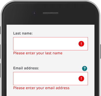
In this example the errors are close to the failing fields. In combination with a big margin between the fields, it is easy to understand where the error messages belongs.
Informative
The more informative, the better.
In our first example the error "Your first name must have at least two letters and no unusual characters" is informative. It is written in a human language. It can be improved, written even more precise:
"Your first name must have only letters, not numbers."
The more precise, the better. This means that the system needs more error messages for different situations. Be pragmatic when deciding how many different error messages and situations you will create. Ask the users if they understand what is wrong. If not, write the error more precise.
Assosiated with the form control
But what about the code?
<input name="firstName" id="firstNameInput" type="text" pattern="[^.]*?">
<p id="firstName-length-error" role="alert">Your first name must have at least two letters and no unusual characters</p>
The error has the role alert. This is good. It would make a screen reader read out the content, even though it is not in focus.
The error message is not assosiated with the field. This can be done using the aria-describedby attribute. The value is the ID of the error message.
Also, we should add aria-invalid="true" on the invalid form control to tell screen readers that the form control has failed. An improved version of the input field:
<input name="firstName" id="firstNameInput" type="text" pattern="[^.]*?" aria-describedby="firstName-length-error" aria-invalid="true">
Move focus
This is more important for server-side validations, compared to client-side validation. When the user submits a form, the focus moves to the first invalid field.
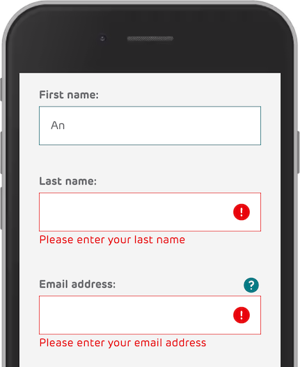
In this example, all three fields have been invalid. The focus was moved to the first field, First name. The error is removed when the user starts typing.
