Tutorials References Menu

CSS Reference

CSS Reference CSS Browser Support CSS Selectors CSS Functions CSS Reference Aural CSS Web Safe Fonts CSS Font Fallbacks CSS Animatable CSS Units CSS PX-EM Converter CSS Colors CSS Color Values CSS Default Values CSS Entities

CSS Properties

align-content align-items align-self all animation animation-delay animation-direction animation-duration animation-fill-mode animation-iteration-count animation-name animation-play-state animation-timing-function backface-visibility background background-attachment background-blend-mode background-clip background-color background-image background-origin background-position background-repeat background-size border border-bottom border-bottom-color border-bottom-left-radius border-bottom-right-radius border-bottom-style border-bottom-width border-collapse border-color border-image border-image-outset border-image-repeat border-image-slice border-image-source border-image-width border-left border-left-color border-left-style border-left-width border-radius border-right border-right-color border-right-style border-right-width border-spacing border-style border-top border-top-color border-top-left-radius border-top-right-radius border-top-style border-top-width border-width bottom box-decoration-break box-shadow box-sizing break-after break-before break-inside caption-side caret-color @charset clear clip clip-path color column-count column-fill column-gap column-rule column-rule-color column-rule-style column-rule-width column-span column-width columns content counter-increment counter-reset cursor direction display empty-cells filter flex flex-basis flex-direction flex-flow flex-grow flex-shrink flex-wrap float font @font-face font-family font-feature-settings font-kerning font-size font-size-adjust font-stretch font-style font-variant font-variant-caps font-weight gap grid grid-area grid-auto-columns grid-auto-flow grid-auto-rows grid-column grid-column-end grid-column-gap grid-column-start grid-gap grid-row grid-row-end grid-row-gap grid-row-start grid-template grid-template-areas grid-template-columns grid-template-rows hanging-punctuation height hyphens @import isolation justify-content @keyframes left letter-spacing line-height list-style list-style-image list-style-position list-style-type margin margin-bottom margin-left margin-right margin-top max-height max-width @media min-height min-width mix-blend-mode object-fit object-position opacity order outline outline-color outline-offset outline-style outline-width overflow overflow-x overflow-y padding padding-bottom padding-left padding-right padding-top page-break-after page-break-before page-break-inside perspective perspective-origin pointer-events position quotes resize right row-gap scroll-behavior tab-size table-layout text-align text-align-last text-decoration text-decoration-color text-decoration-line text-decoration-style text-indent text-justify text-overflow text-shadow text-transform top transform transform-origin transform-style transition transition-delay transition-duration transition-property transition-timing-function unicode-bidi user-select vertical-align visibility white-space width word-break word-spacing word-wrap writing-mode z-index


CSS radial-gradient() Function

❮ CSS Functions Reference

Example

A radial gradient with evenly spaced color stops:

#grad {
  background-image: radial-gradient(red, green, blue);
}
Try it Yourself »

More "Try it Yourself" examples below.


Definition and Usage

The radial-gradient() function sets a radial gradient as the background image.

A radial gradient is defined by its center.

To create a radial gradient you must define at least two color stops.

Example of Radial Gradient:
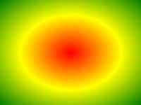
Radial gradient

Version: CSS3

Browser Support

The numbers in the table specify the first browser version that fully supports the function.

Numbers followed by -webkit-, -moz-, or -o- specify the first version that worked with a prefix.

Function
radial-gradient() 26.0
10.0 -webkit-
10.0 16.0
3.6 -moz-
6.1
5.1 -webkit-
12.1
11.6 -o-


CSS Syntax

background-image: radial-gradient(shape size at position, start-color, ..., last-color);
Value Description
shape Defines the shape of the gradient. Possible values:
  • ellipse (default)
  • circle
size Defines the size of the gradient. Possible values:
  • farthest-corner (default)
  • closest-side
  • closest-corner
  • farthest-side
position Defines the position of the gradient. Default is "center"
start-color, ..., last-color Color stops are the colors you want to render smooth transitions among. This value consists of a color value, followed by an optional stop position (a percentage between 0% and 100% or a length along the gradient axis).

More Examples

Example

A radial gradient with differently spaced color stops:

#grad {
  background-image: radial-gradient(red 5%, green 15%, blue 60%);
}
Try it Yourself »

Example

A radial gradient with the shape of a circle:

#grad {
  background-image: radial-gradient(circle, red, yellow, green);
}
Try it Yourself »

Example

A radial gradient with different size keywords:

#grad1 {
  background-image: radial-gradient(closest-side at 60% 55%, blue, green, yellow, black);
}

#grad2 {
  background-image: radial-gradient(farthest-side at 60% 55%, blue, green, yellow, black);
}
Try it Yourself »

Related Pages

CSS tutorial: CSS Gradients


❮ CSS Functions Reference